
I’ve showcased some projects and features applied to under-performing websites. By focusing on a more modern customer experience, adding lead magnets, on-page and technical SEO for organic traffic, and more, we saw immediate website performance improvements.
One site showed immediate results, with nearly 200% increase in traffic and 35% increase in revenue in only three months.
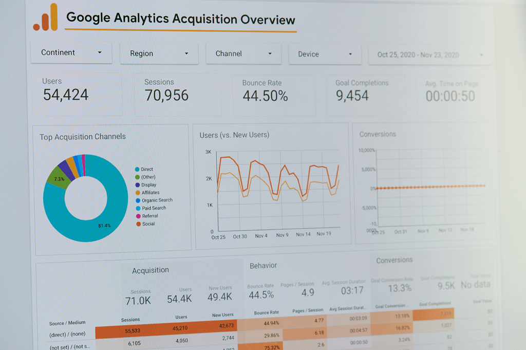
The following videos show detailed web design updates, including before and after examples. I hope these provide you with some ideas for your own site!
Organic Traffic: Adding a Blog
Adding a blog to a website helps bring in organic traffic while providing content for paid search topics, and establishing the company as a thought leader within an industry. The resources also provide additional value to visitors.
Additional project scope included:
- An updated navigation menu
- New design and brand guidelines
- Increased lead generation strategies
We added several internal links to our blogs to help promote continued engagement, as well as external links to build authority.
Lead Generation: Free Demo course
Like most SaaS products, a free demo is a great way for potential customers to experience your product prior to purchasing while gathering first person data for marketing efforts.
In order to widen the funnel and increase inbound marketing leads, I added promotional content for an existing free demo course. I felt it was buried on the site and not being leveraged appropriately.
This strategy required the creation of:
- A new landing page for the demo course
- An enhanced Product Detail Page for the demo course
- Lead magnet content blocks placed throughout the site
Once I created and implemented this demo content, we saw an immediate benefit with MQLs increased by over 100% within the first month.
Watch the loom video (no sound) for an example of the updates, comparing old vs. new.
Conversion Tactics
Direct Checkout + Upsells
This UX and revenue-growth project consisted of streamlining the buyer journey, both on-site and via email attribution, providing a cleaner, simpler checkout experience while implementing post-purchase upsell and cross-sell offers. It proved to be hugely successful.
We garnered an immediate return on investment by offering state-specific, personalized courses to an existing purchase. Within only 6 months, analytics showed that the:
- AVERAGE REVENUE PER USER increased by 37%
- AVERAGE ORDERS PER USER Increased from 0.8 TO 2.2
- TOTAL REVENUE increased by 29% and counting
I applied this strategy to both the website and email marketing initiatives, with an automated, post-purchase email workflow directing people straight to the checkout, with the discount code automatically applied, for an easy, friction-less purchase.
Note: the design of the website and upsell/cross-sell offers have been improved since this video. However, this should provide an idea of the final product.
View the Loom video, below, to walk through the buyer journey from email to purchase (no sound).
Full-Width Hero Banner
I have mixed feelings about header carousels, (see my research into this topic here), but I can understand the appeal of a full-width image and CTA. We had to get creative to implement this feature on an existing WordPress site.
The before and after loom video, below, shows the original website followed by an example of the updated site with the added full-width hero banner and carousel added (no sound).
Interested in more examples of UX and design projects? Visit my Website & UX category, or view my gumroad content.
Let’s connect!
Interested in learning more about my background, or scheduling a call? Let’s discuss how I can contribute to your organization!