How to approach, and present, your key metrics
The intersection between automation, technology, AI, and data analysis is primed to grow exponentially in the coming years. This is where I like to position myself. As marketing teams evolve, I envision the locus of these needs becoming more vital to both scalable growth and meeting business objectives. Clearly, data is a core component of this intersection of expertise. I’ve outlined some of my skills and approaches to data analytics below.
The Pareto Principle
The Pareto principle, often known as the 80/20 rule, suggests that roughly 80% of effects come from 20% of causes. In data analysis, this principle can be a powerful tool to identify the most impactful factors or elements in a dataset. Here’s how you can apply and present it:

Identifying Key Data Points
- Analyze the Data: Start by examining your dataset to find the critical few (the 20%) that contribute the most to the results (the 80%). For example, in sales data, you might find that 20% of your customers generate 80% of the revenue.
- Sort and Rank: Organize your data by sorting it from highest to lowest impact. This helps in clearly identifying the top contributors.
Visualizing the Data
- Pareto Chart: Create a Pareto chart, which is a combination of a bar and line chart. The bars represent individual values in descending order, and the line represents the cumulative total. This visualization quickly shows which factors are most significant.
- Highlighting the 20%: Use color, labels, or annotations to highlight the top 20% of contributors. This makes it easier for your audience to grasp the key insights.
Telling the Story
- Start with the Insight: Begin your presentation by stating the key insight—what the top 20% is and how it drives the majority of the results. For instance, “We’ve found that 20% of our product offerings account for 80% of our sales.”
- Provide Context: Explain why these particular factors are so impactful. Dive into specifics, such as why certain customers or products are more significant, and the implications for your strategy.
- Actionable Recommendations: Based on the 80/20 analysis, suggest actionable steps. For example, “Given this insight, we should focus our marketing efforts on these high-performing products to maximize ROI.”
- Use Comparisons: Show before-and-after scenarios, or compare segments within the data, to illustrate how focusing on the top contributors can lead to better outcomes.
Engaging the Audience
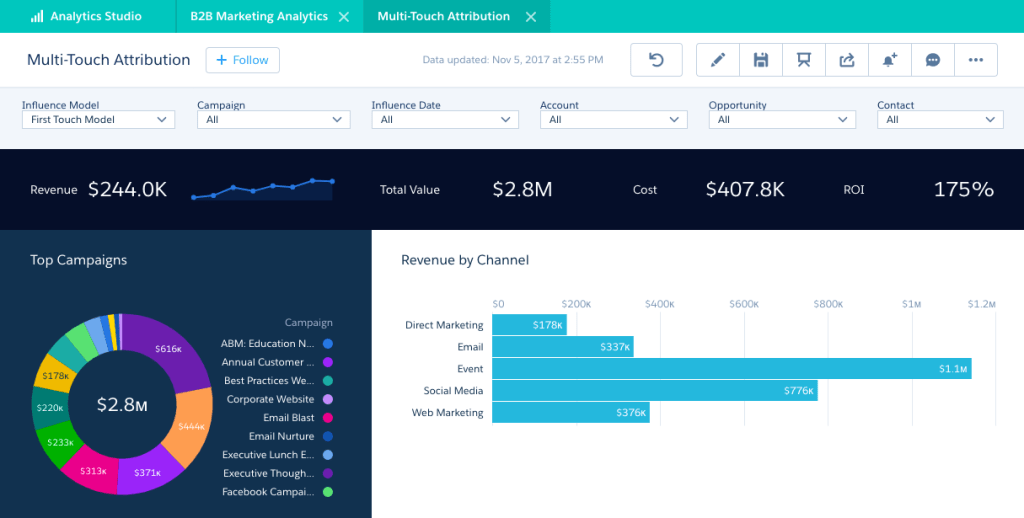
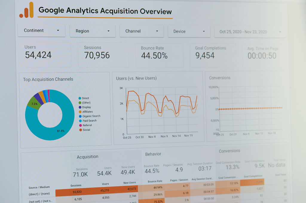
- Interactive Dashboards: If possible, use interactive dashboards that allow your audience to explore the data themselves. They can see how tweaking variables impacts the 80/20 balance.
- Storytelling Techniques: Weave the data into a narrative that resonates with your audience. Relate the data to real-world examples or hypothetical scenarios that they can relate to.
By focusing on the most impactful data points and presenting them in a clear, engaging way, you not only inform your audience but also guide them towards data-driven decisions.
Methodologies
When diving into data analysis and storytelling there are several popular principles, approaches, and techniques that can work best for your information and audiences. These can also complement the Pareto principle. Here are some additional concepts worth noting:
Segmentation Analysis
- Definition: This involves dividing your data into distinct groups or segments based on shared characteristics (e.g., customer demographics, behavior, or product usage).
- Application: By analyzing these segments, you can identify specific groups that contribute disproportionately to your outcomes or require targeted strategies. For instance, you might find that a particular demographic segment is more likely to purchase certain products.
Root Cause Analysis
- Definition: Root cause analysis (RCA) is a method used to identify the underlying reasons for observed patterns or issues within your data.
- Application: After identifying the critical few using the Pareto principle, RCA helps you understand why those factors are so influential. This can involve techniques like the 5 Whys, Fishbone Diagrams, or failure mode and effects analysis (FMEA).
Correlation vs. Causation
- Definition: Correlation analysis helps you understand the relationship between two variables, while causation identifies whether one variable directly causes an effect in another.
- Application: When telling your data story, it’s crucial to differentiate between correlation and causation. Just because two factors are correlated doesn’t mean one causes the other, which could lead to incorrect conclusions if not properly addressed.
Regression Analysis
- Definition: Regression analysis is a statistical method to examine the relationship between a dependent variable and one or more independent variables.
- Application: This can help you predict outcomes based on different scenarios and identify the strength of relationships between variables. It’s particularly useful in forecasting and trend analysis.
Data Visualization Best Practices
- Definition: Effective data visualization involves using charts, graphs, and other visual tools to represent data clearly and effectively.
- Application: Beyond Pareto charts, consider using heat maps, scatter plots, or bubble charts to highlight relationships and trends. Ensure that your visuals are not only accurate but also tailored to your audience’s level of expertise.
ABC Analysis
- Definition: ABC analysis is a technique for categorizing items based on their importance, typically into three categories: A (most important), B (moderately important), and C (least important).
- Application: Often used in inventory management, it can be applied to various data sets to prioritize focus areas. For instance, in customer data, A-customers might represent those generating the highest revenue.
SWOT Analysis
- Definition: SWOT analysis identifies Strengths, Weaknesses, Opportunities, and Threats related to a business or project.
- Application: Use SWOT in conjunction with data analysis to provide context to your findings. For example, understanding the strengths and weaknesses revealed by your data can lead to more strategic recommendations.
Descriptive, Predictive, and Prescriptive Analytics
- Descriptive Analytics: Focuses on what has happened, summarizing historical data to identify patterns.
- Predictive Analytics: Uses statistical models and machine learning to forecast future outcomes based on current data.
- Prescriptive Analytics: Goes a step further by suggesting actions to achieve desired outcomes based on predictions.
- Application: Integrate these different analytics approaches into your analysis to provide a comprehensive view, from understanding past performance to recommending future actions.
A/B Testing and Experimentation
- Definition: A/B testing involves comparing two versions of a variable (e.g., a webpage or email) to determine which performs better.
- Application: Use A/B testing to validate assumptions derived from your data analysis. For example, if data suggests a certain webpage layout drives more conversions, an A/B test can confirm this.
Data Quality and Governance
- Definition: Data quality refers to the accuracy, completeness, and reliability of your data, while governance involves managing the availability, usability, integrity, and security of the data.
- Application: Ensuring high data quality and robust governance practices is essential for trustworthy analysis. Poor data quality can lead to misleading insights, so always validate your data before analysis.
Storytelling with Data
- Narrative Structure: Craft a narrative that moves from data to insight to action. The goal is to lead your audience through the data journey, ending with clear, actionable takeaways.
- Audience Focus: Tailor your story to your audience’s level of expertise and interests. Simplify complex data into relatable insights that resonate with them.
- Contextualization: Provide context around the data, explaining not just what the numbers are, but what they mean in the broader business or societal context.
By integrating these techniques and principles into your data analysis, you’ll be better equipped to extract meaningful insights, make data-driven decisions, and communicate effectively with your audience.
More Data Posts:
Posts
Let’s connect!
Interested in learning more about my background, or scheduling a call? Let’s discuss how I can contribute to your organization!


