Marketing Analytics is all about turning numbers into narratives. In the next paragraphs, I’ll review the graphs and metrics crucial for every marketer—whether it’s understanding trends with line charts, comparing performance with bar graphs, or tracking efficiency with conversion metrics. By demystifying the visuals behind the data, this will help to show how the right analytics not only measure results, but also uncover opportunities to optimize campaigns and drive smarter business decisions.

Metrics to Track for Actionable Insights

Event tracking
Correctly setting up event tracking (through Google Tag Manager and with UTM parameters) helps understand key points along the user journey as well as lead magnet performance.
Trend Analysis
Identify usage trends among users. Find out which features are most popular by segment, cohort, and time period.


Funnel Analysis
Use a Funnel Analysis report to understand where users are getting stuck and falling out of the pipeline. Identify friction points that are affecting user activation, feature adoption, and expansion revenue.
Path Analysis
Use the GA4 Path Explorer feature to determine user behavior, including where users enter and exit the funnel, and where the most churn occurs.

Retention (Cohort) Analysis
Track user retention for different segments and features over time. This also helps understand user and product stickiness.
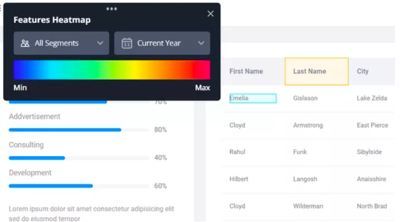
Heatmaps (user behavior)
Use a tool with session replay and heatmaps to gain a deep, qualitative understanding into user behavior – and where they’re getting stuck. This provides more context behind the data and can also indicate UX errors.
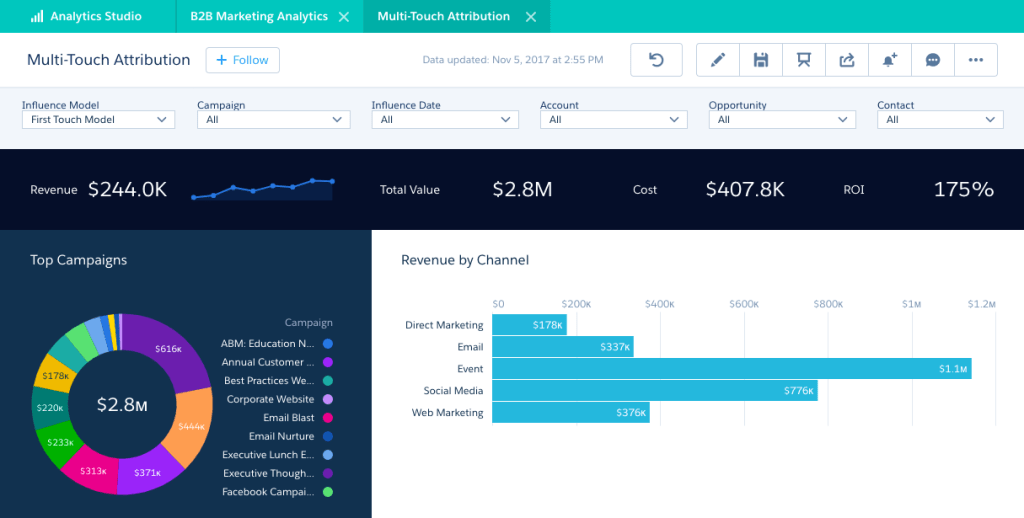
Executive Summary Dashboard example:

Data Presentation Tips
I approach data presentation with a focus on simplifying the complex, providing foundational data knowledge, and adhering to the following principles:

Use visuals
Charts and graphs are much better than a written paragraph of statistics. Note: it’s important to use the right type of chart or graph. More on this in future sections.
Include results upfront
Results are page one in the report! Charts and graphs are much better than a written paragraph of statistics.

Don’t bury bad results
Charts and graphs are much better than a written paragraph of statistics. Note: it’s important to use the right type of chart or graph. More on this in future sections.

Keep it concise
Charts and graphs are much better than a written paragraph of statistics. Note: it’s important to use the right type of chart or graph. More on this in future sections.

Use section headers
Charts and graphs are much better than a written paragraph of statistics.

Incorporate multiple data sources
Charts and graphs are much better than a written paragraph of statistics. This also adds authority.
Presenting your Data
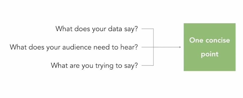
Telling the Data Story
When presenting your data, it’s important to keep the information brief but robust.
You don’t need to give your audience the entire suite of data, but you do need to provide enough context to prove you’ve thoroughly analyzed, without bias, the results you’re presenting.
I like to use these proven tips to help present data effectively:

Narrow the focus: Know what your audience is looking for and trim away anything not needed for the report.
Keep reports concise. This is crucial for effective data visualization. I use KWYs (know what you’re saying) to help narrow down the information to what’s most important, and often include an appendix and/or “leave behind” reports with more information.


Prioritize: It’s essential to prioritize specific data points and questions to avoid overwhelming your audience. I rely on the adage: If you prioritize everything, you end up prioritizing nothing.
Ask questions to identify insights: I channel my inner 5-year old and ask why, repeatedly, to drill down to the core message and insights that I need to convey. This helps to refine the data and the message for clarity and impact.

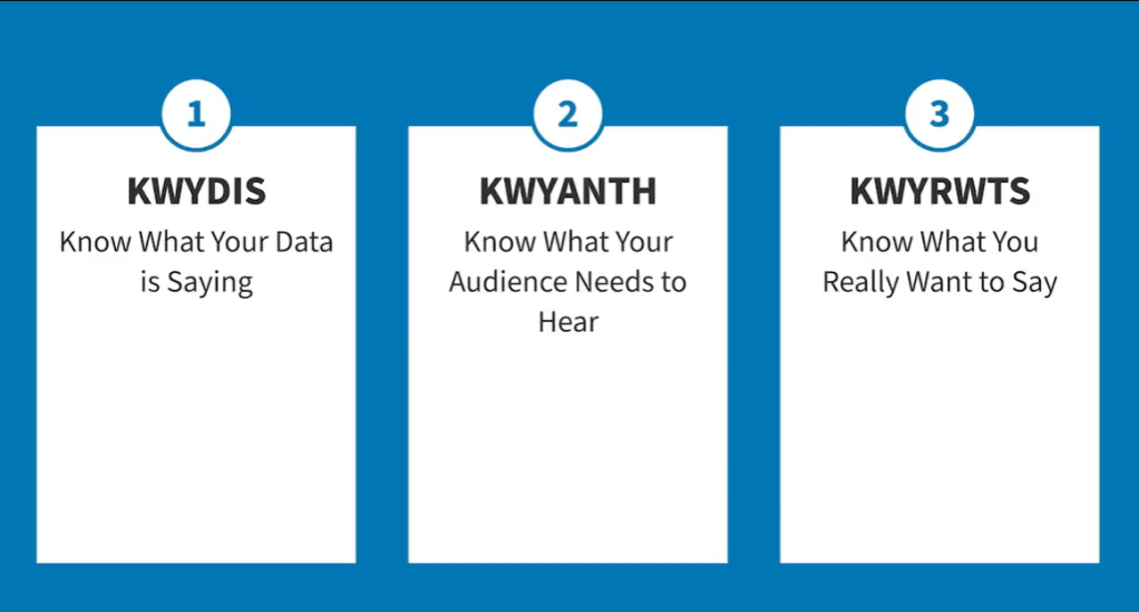
While ‘KWY’ (know what you’re saying) is useful, it’s not the only ridiculous acronym that helps refine presentations.
Introducing KWYDIS, KWYANTH, and KWYRWTS:
The Psychology of Data Presentations
Pre-Attentive Processing
Humans have an amazing ability to immediately recognize and make subconscious visual judgements. This is called pre-attentive processing, and it’s useful to keep in mind when designing data dashboards.
Human brains also naturally look for patterns. We use this mentality to create charts that are simple but effective. A bar chart, for example, is incredibly easy and quick for our brains to understand. Our brains can easily and effectively comprehend the values of the rectangles, in comparison to each other, in a bar chart.

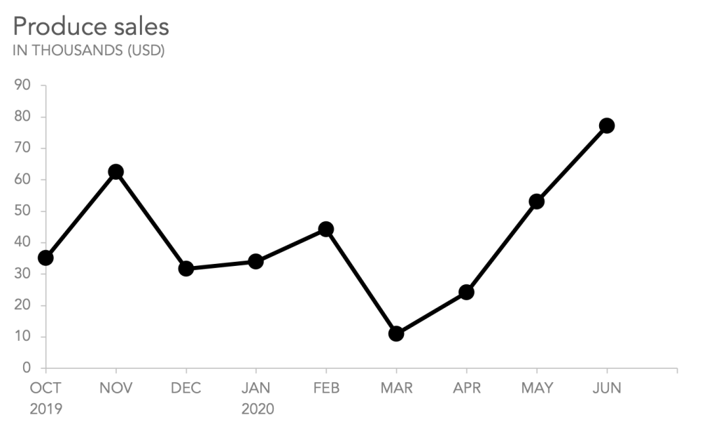
This is also true for line graphs. While bar charts compare the same metric against itself, Line graphs are ideal for displaying changes over time.
Line graphs are also great for:
- Comparing lots of data all at once
- Showing changes and trends over time
- Including important context and annotation
- Displaying forecast data and uncertainty
- Highlighting anomalies within and across data series
Meanwhile, line graphs are not generally ideal for:
- Showing sparse data sets
- Displaying quantities of things
- Working with categorical data
- Making part-to-whole comparisons
A typical line graph will have continuous data along both the x-axis and y-axis. The y-axis usually shows the value of the variable we are measuring; the x-axis is most often used to show when we measured it, either chronologically or based on an independent variable. (TL;DR: Y-axis = number, X-axis = date)
Line Graphs ‘Best practice’ states that you can use more than one line in a line graph, but to avoid clutter and confusion, avoid using more than five lines.
If you must use more than five, use strategic design to differentiate the most important information like line thickness, shading, and color.

Line graphs only make sense when there is a meaningful relationship between successive points on the line.
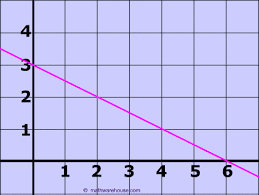
Similar to line graphs, Slope Graphs are useful for displaying variables over time.
They are simpler than line graphs because they only show a beginning and end point, without noting all the specifics in between.
Distribution data charts are useful for showing an overall trend while also showing the individual data points in a way that does not overwhelm your audience.
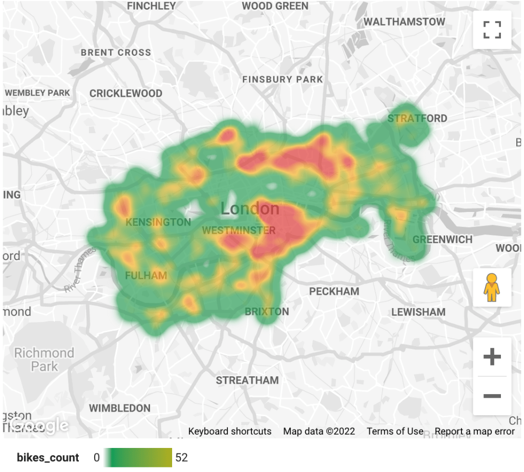
Heat Maps: Best Practices
Heatmaps are valuable visualization tools that use colors to represent data values, making it easy to identify patterns, trends, and areas of interest within datasets. They are especially valuable for analyzing user behavior on websites or understanding complex data distributions.
Choose an appropriate color palette
Color is, obviously, a core component of this chart type. Most frequently, there will be a sequential color ramp between value and color, where lighter colors correspond to smaller values and darker colors to larger values, or vice versa. However, a diverging color palette may be used when values have a meaningful zero point.
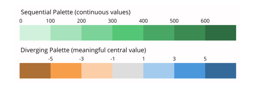
Google Looker Studio, for example, uses default red and green for geographic heat maps. This color combo is understood instinctively. But when reports get more complicated and use more than one variable, then it’s important to use colors wisely. It’s also key to follow the latest accessibility standards.
Additional Best Practices
Include a legend
Sort levels by similarity or value
Include useful tick marks
Since the data may be grouped in bins, if it’s possible to add tick marks in each category without overcrowding the chart then great. If not, sort bins by larger values with useful tick marks as differentiators.

Include values in key cells
There is a lack of precision for mapping color to value, especially compared to other encodings like position or length. When possible, add cell value annotations to the heatmap as a double encoding of value.
Heatmap Summary
Heatmaps are powerful data visualization tools that use color to highlight patterns, trends, and user behaviors across datasets, making them especially useful for website analytics and complex data distributions.
To use them effectively, it’s essential to choose an appropriate color palette—sequential for linear data or diverging when there’s a meaningful midpoint—and to consider alternatives like bubble maps for multi-dimensional insights.
Best practices include adding a clear legend, sorting data by value or similarity, including meaningful tick marks, and displaying numeric values in key cells to offset the inherent lack of precision in color encoding. This will enhance readability and ensure your heatmap delivers actionable insights.
Bubble Maps
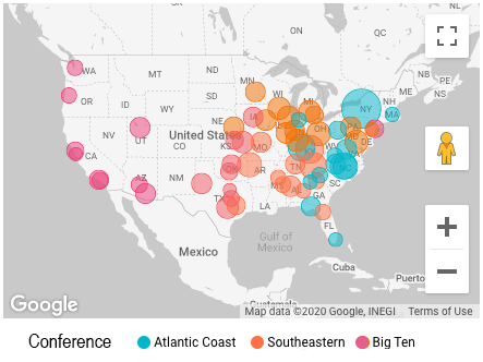
Another valuable option is to use a Bubble Map (left). This allows you to use both color intensity and the size of the bubbles to indicate values.
In this bubble graph we can clearly see that the Atlantic Coast conference bubbles (blue) are larger than the other conferences.
Let’s connect!
Interested in learning more about my background, or scheduling a call? Let’s discuss how I can contribute to your organization!