
Assess your data maturity
As your business grows and/or shifts to the cloud, there are four stages of maturity your data passes through. Understanding which stage you’re at will help you understand how to address your specific needs when it comes to BI reporting.
There are entire books on this process. This is just a quick summary.
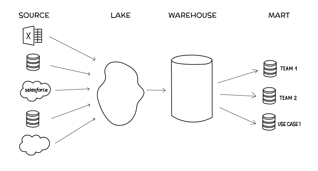
Stage 1: Source data (scattered)
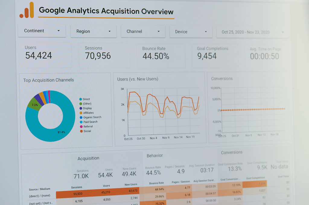
The source data stage is when your data is scattered among a couple of individual sources, like Google Analytics, Salesforce, and an individual database or two. At this stage, when it comes to BI reporting, the bulk of the work has to do with wrangling your disparate data sources. You’re forced to conduct analysis in silos (e.g. within Salesforce alone) without an easy way to combine that data with other source data besides dumping it all into Google Sheets, which can turn into a silo of its own.
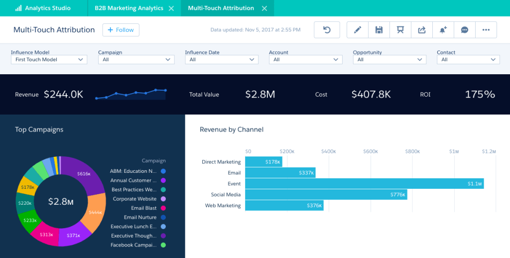
For an example, in a recent job I designed the data reporting for Account Based Marketing. First, I listed the types of data we’d want to calculate, followed by what data we had access to at the time, and finally, a plan for structuring, centralizing, and shipping the data for analyzation and visualization. Here is a sneak peek of that plan:
Stage 2: Lake
(centralized and unstructured)
The data lake stage is when you first start combining data across sources (i.e., blending data) into a central spot where it all exists together, usually in an unstructured way. To do BI reporting at the lake stage, you’ll need to do some preliminary transformations, like column selection or hashing out personally identifiable information, to make sure all your data can work together.
Stage 3: Warehouse
(centralized and structured)
The data warehouse stage is when you structure your centralized data in a way that makes it easier to use across your organization. BI reporting at the warehouse stage is a breeze (with the right BI platform, which we’ll get into later), and most of your work will be querying and visualizing data.
Stage 4: Mart
(centralized, structured, and specialized)
The data mart stage is when teams across your organization need specialized access to only certain sections of your structured data. BI reporting at the data mart stage is also fairly simple but should be focused on empowering non-technical users to create reports or dashboards on their own.
There’s a lot of nuance we’re glossing over here. The important thing is to recognize which stage your business currently fits within and use that knowledge to help you select the right BI reporting platform.
Choose your BI platform
To perform business intelligence analyzation and reporting, you need a (you guessed it) BI platform. A good BI platform fulfills three roles, each of which will help you navigate through the four stages of cloud data maturity. Choose your BI platform based on how well it:
gathers data
Whether it’s a set of sources, a lake, or a warehouse, your BI platform should be able to ingest all the data you need. It should also allow you to blend your data together into a more cohesive dataset.
Helps you understand data
Your BI platform should provide the ability to model data and query your data using SQL. AI also will be more prominent in this space.
Visualizes data
Finally, your BI platform should have an easy way to turn your queried data into reports and dashboards that you can then share and use for decision-making.
The ability to visualize data in order to help your team make better, more informed decisions is a core function for every BI platform, and helps businesses across all maturity stages.
Again, we’re just breezing through the core concepts. You can find extensive information on how to choose a BI platform. The goal of this post is to understand the core functions of the platforms that impact your BI reporting process.
Understand the difference between reports and dashboards
BI reporting encompasses two different types of visualizations: reports and dashboards. There’s a small but important difference between the two, and you need to understand this difference to do the right type of reporting.
Reports are static and use historical data to predict the future. The purpose of a report is to provide an in-depth analysis of events that have passed in order to inform decision-making and project trends. Because of this more comprehensive nature, reports tend to be more work and are created at regular intervals, like weekly, monthly, quarterly, etc.
Dashboards are real-time and often interactive, focusing on in-the-moment decision-making. The purpose of a dashboard is to provide a pulse check on how certain metrics are performing. Dashboards usually have some up-front setup time involved but take care of themselves from there on out, with the occasional tweak here and there.
For the purposes of this article, the act of “business intelligence reporting” will describe the process of creating both reports and dashboards because they both visualize data to inform decision-making. As we’ll get into with step #5, knowing this difference helps you hone in on the purpose of your BI reporting.
Connect your sources
Once you’ve chosen and set up your BI platform, it’s time to hook up your data. There are two overall ways to connect your data to your BI platform:
Direct connection
BI platforms have proprietary connections that do most of the work for you. All you have to do is provide login details and possibly a special key for each data source. A good initial marker for the quality of a BI platform is its library of connections: the more, the better.
SSH tunnel
For everything else, you can have your developers set up an SSH tunnel to securely connect your data source/lake/warehouse to your BI platform. This more technical option is best for businesses that have their databases on private connections or have firewall considerations to take into account.
Set Your Goal and Audience
Once you have your data connected to your BI platform, you need to clearly define the purpose of your BI reporting. BI visualizations need to support decision-making. Set your audience according to your answers to these questions:
What do you want to accomplish?
You may just want to slap together a quick ad hoc visualization to illustrate a concept. Or maybe you need to put some “oomph” behind a comprehensive report you’ve been planning for weeks. Either way, a clearly defined goal behind your visualization will keep you on track and keep your work from ballooning on you.
Who is the audience?
Busy business leaders have a lot on their plate and may just need an executive summary. Individual contributors, on the other hand, may want to scrutinize and dive deep. Or vice versa. It all depends on who your audience is, so make sure you’re tailoring every aspect of your BI reporting to their needs.
Why do they need data?
In other words, what decision is your audience making that needs more supporting data? Think through how they’re going to use this data and when they’ll use it. Maybe they need a static, one-time report. Or they might need a real-time dashboard they can check throughout the day. Keep this purpose front and center in your mind as you create your visualizations.
Query your data
Next, it’s time to pull in the data you need using queries. The data you use should be determined by your goal and audience.
You write queries with SQL, a coding language designed to interface with databases and data warehouses. Queries select the ranges of data you’d like to compare and allow you to join them for easier comparison. For instance, you can pull marketing qualified leads from one source, like HubSpot, and compare them to advertising spend from Facebook.
SQL is the only way to query data, so it pays to get familiar with it. That said, many BI platforms have proprietary ways of working with SQL to make it simpler for non-technical folks to use. For instance, we created Visual SQL, which allows anyone to build queries with no SQL knowledge required.
Visualize your data
Now comes the fun part: creating the charts. In most analytics platforms, once you’ve queried your data, your results will appear in a table that you can then customize.
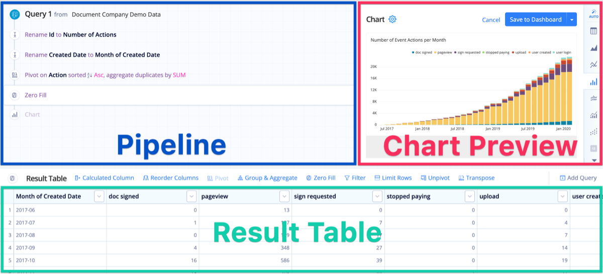.png?cdnVersion=2161)
Tweaking your visualizations is as simple as working with the Table in the same way you would a spreadsheet, then manipulating the automatically generated charts in the Chart Preview. Once you’re done creating your chart, all that’s left is to click the big blue “Save to Dashboard” button.
This process is unique to each BI platform so this doesn’t cover everything. Just make sure you compare and research thoroughly before selecting one visualization over the other.
Share your report/dashboard
The context in which you share your BI reporting is just as important as the report or dashboard itself. In short, you need to share your visualizations in a manner in which they can be acted upon. A few options to consider include:
- Embedding the dashboard online, in your own product, or within other tools.
- Keeping the report/dashboard in the BI platform itself, granting access or providing links to others who have logins.
- Sharing the report/dashboard on a TV or monitor.
- Creating an automated email report and Slack alerts tied to certain dashboard conditions.
- If using Power BI, you’ll need to publish your reports to the online service in order to share drill-down capability with your stakeholders. These are just a few examples – again, all platforms are slightly different.
Hopefully this helps give you ideas to get started! Check out this page for more information.
Let’s connect!
Interested in learning more about my background, or scheduling a call? Let’s discuss how I can contribute to your organization!
ABM Data Strategies
Account-based marketing requires a different, unique approach to data and analytics. Here are some of the types of data I focus on when developing data strategies in ABM:

Demographic Data
Includes basic information about the individuals within the target account, including job titles, roles and responsibilities, and geographic locations.

Firmographic Data
Focuses on characteristics of the targeted account like industry, size, growth stage, revenue, and structure.

Technographic Data
Insights into the tech stack used by the targeted account including software, tools, platforms and IT infrastructure.

Behavioral Data Tracks
The actions, and interactions, of individuals in target accounts across various touchpoints including web visits, form submissions, event attendance, and content consumed.

Intent Data
The likelihood or interest of target accounts in purchasing specific products or features.

Engagement Data
Measures the level of interaction and involvement of target accounts with marketing efforts.