Data and analytics play a crucial role in marketing operations and ecommerce, and I regularly generate reports and dashboards based on the needs and requests of stakeholders.
I have experience developing automated dashboards using a variety of tools, including Excel and Pivot charts, Python, SQL, Google (GA4) Looker Studio, Power BI, and Domo, as well as integrations–with key takeaways and actionable insights for stakeholders, offering insight into performance and informing strategy. I rely on machine learning for predictive analytics.
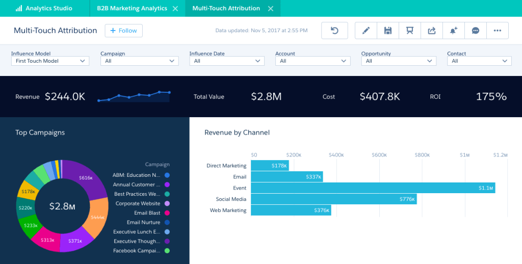
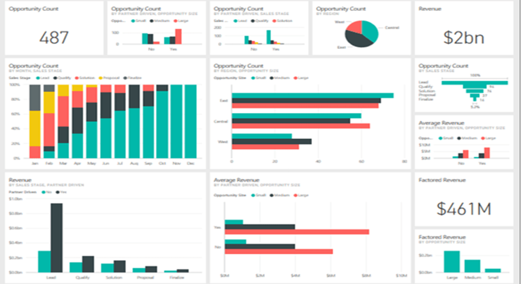
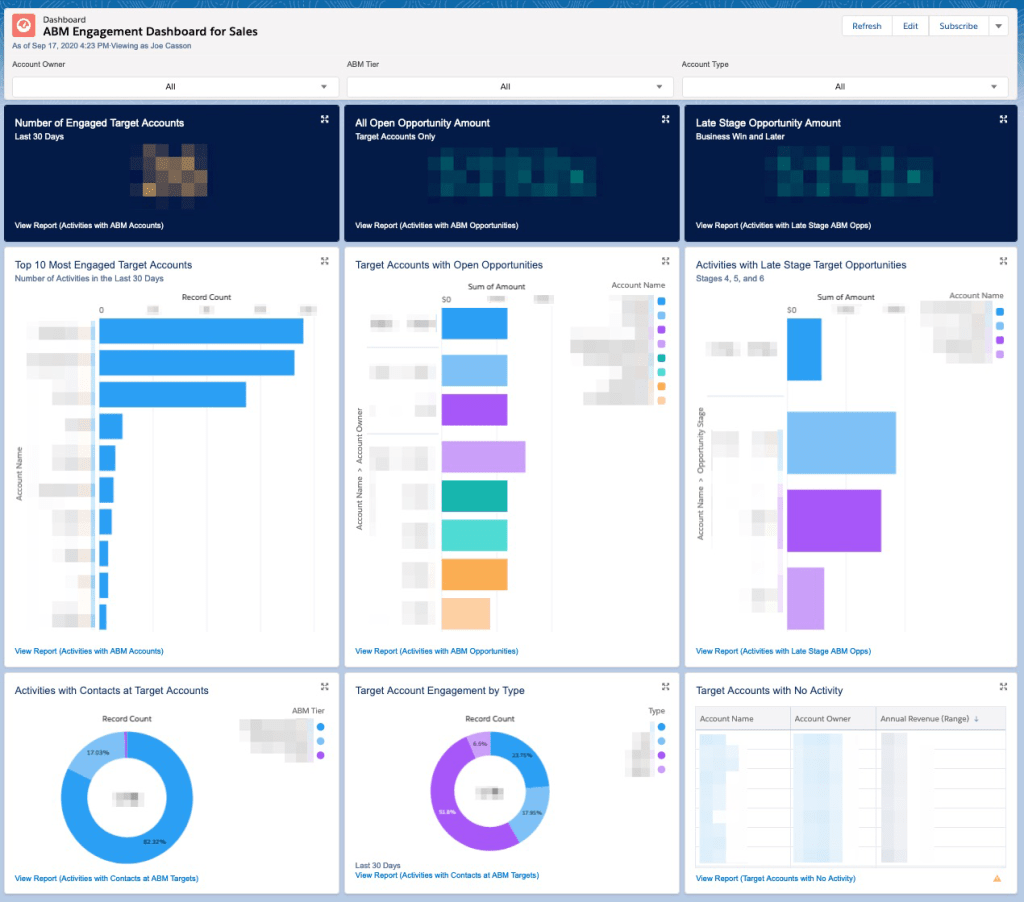
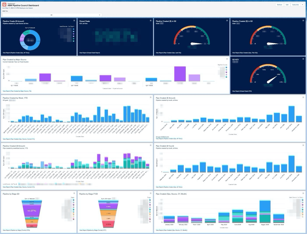
ABM Data Presentations – Power BI
This portfolio highlights ABM-focused Power BI dashboards that turn complex marketing and sales data into actionable insights. By connecting HubSpot and Salesforce data, these reports visualize account penetration, engagement trends, and influenced pipeline to guide strategic decision-making.
By providing clear insights, I enable leadership to identify top-performing campaigns, align go-to-market efforts, and quantify ABM’s contribution to revenue growth.
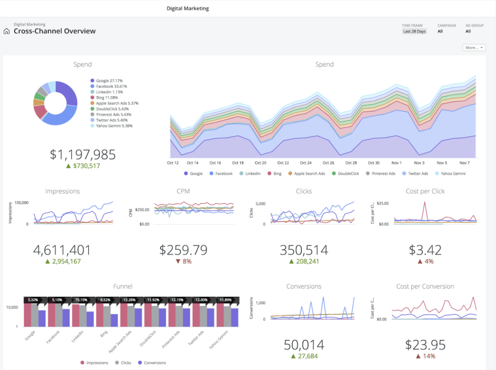


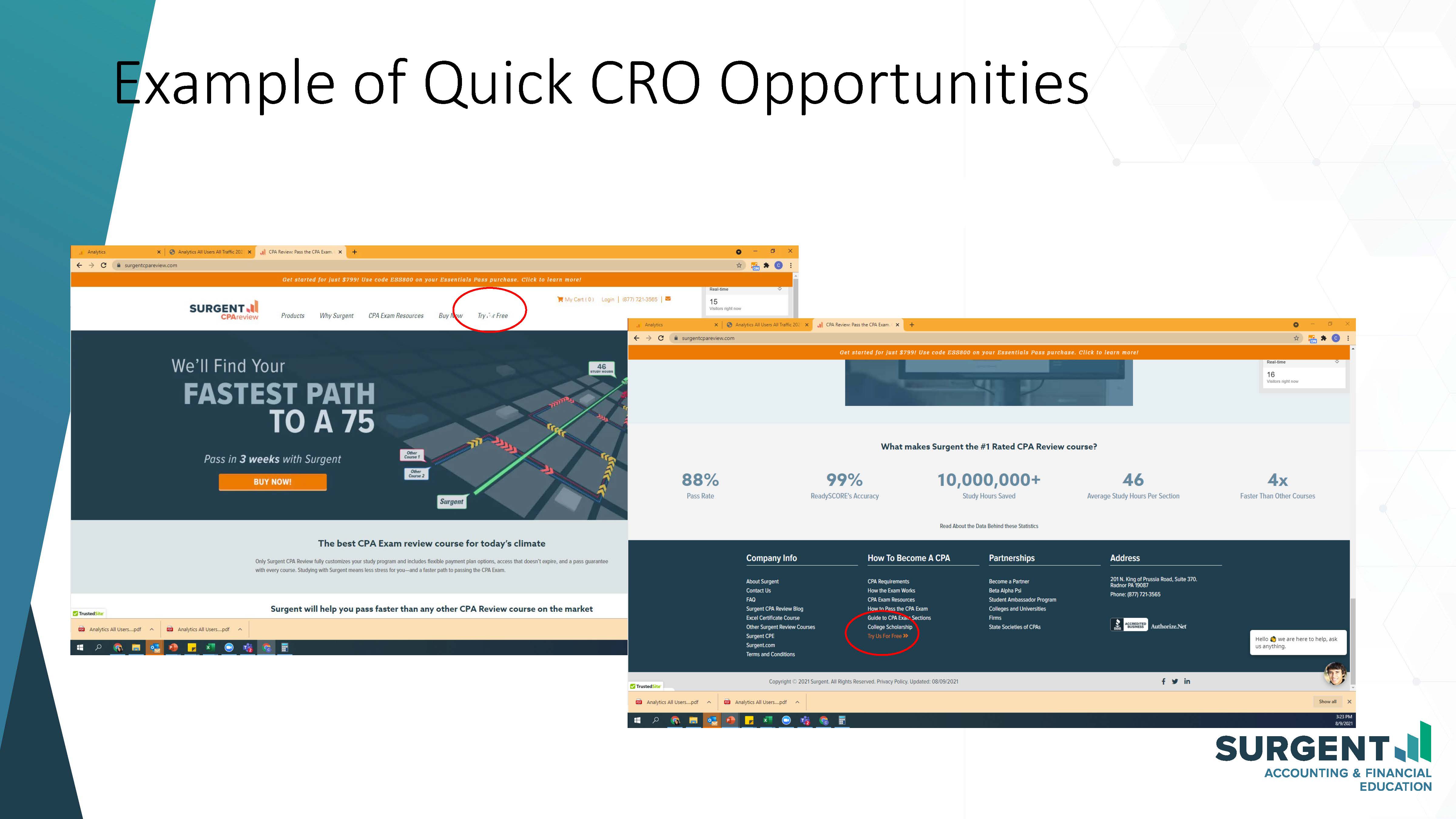
Stakeholder Presentations
These examples illustrate marketing reports organized into PowerPoint decks for presentations and stakeholder review.


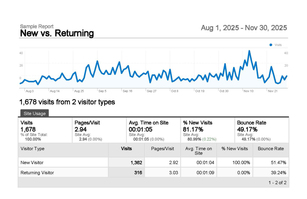
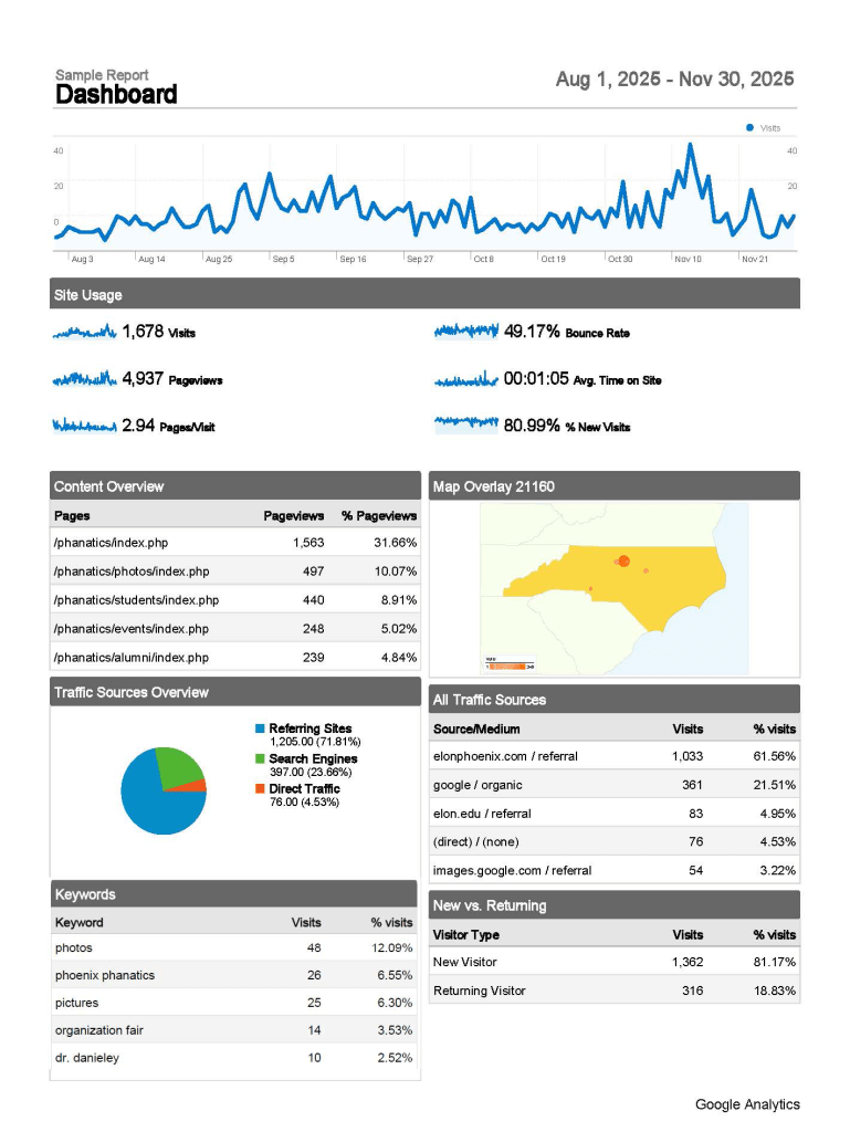

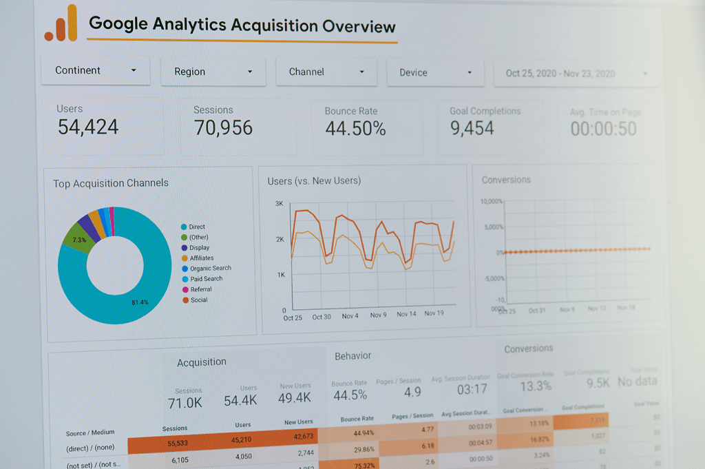
Hubspot Dashboards
As the HubSpot SME, I’m accustomed to using integrations and staying up-to-date with HubSpot features to build real-time dashboards with actionable insights. The below dashboard is very old.
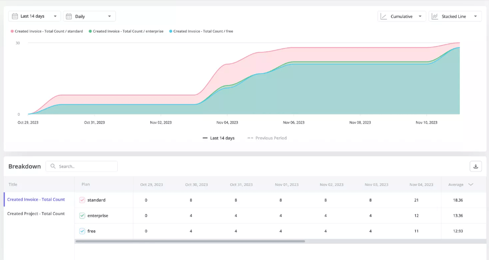
Metrics for Actionable Insights
My approach to providing a 360-degree view of the customer or account, and channel performance, includes focusing on the following metrics:
Event tracking
Correctly setting up GA4 event tracking (generally through Google Tag Manager) helps understand key points along the user journey as well as lead magnets.
Trend Analysis
Identify trends among users, and discover which features are most popular by segment and time period.

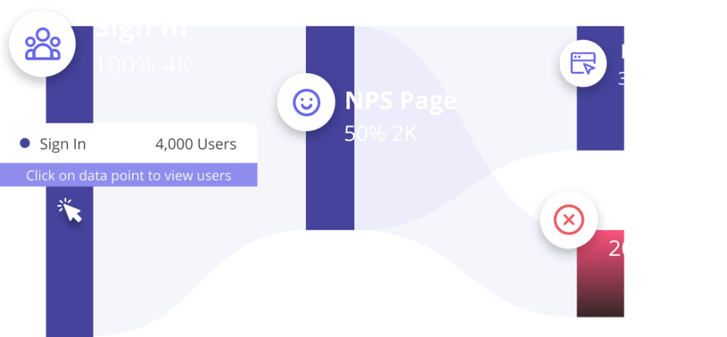
Funnel Analysis
Use Funnel analysis to understand where users are getting stuck. Identify friction points that are affecting user activation, feature adoption, and expansion revenue.
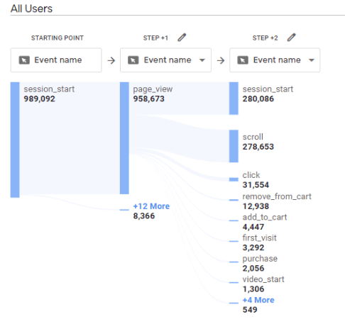
Path Analysis
Using the Path Explorer feature to determine user behavior, including where users enter and exit the funnel, and where the most churn occurs.
Example insight: I found clear examples of “user looping” or “looping behavior”, meaning people were not finding the info they were looking for and converting through the funnel as desired or expected. Result: updated UX based on personas.

Retention (Cohort) Analysis
Track user retention for different segments and features over time to help understand product stickiness.
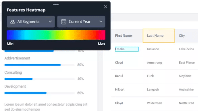
Heatmaps for user behavior
Heatmaps help to provide context behind data. Using session replay and heatmaps allows you to gain a deep, qualitative understanding into user behavior, and where improvements can be made.


Let’s connect!
Interested in learning more about my background, or scheduling a call? Let’s discuss how I can contribute to your organization!